Lightdash ships with built-in chart types — bar, line, pie, table, and more — that cover most use cases. Each built-in chart has its own configuration options you can adjust in the Configure sidebar. When built-in charts aren’t enough, you have two ways to build custom visualizations:
  • Vega-configured charts — one-off charts written as a Vega-Lite spec in a JSON editor. The spec belongs to that chart alone and isn’t reusable elsewhere.
  • Chart Studio — build a completely new, reusable chart type. Describe the chart you want, Lightdash builds it, and anyone in the project can use it like a built-in chart type.
You can also install ready-made chart types from the chart library — a catalog of chart types built by Lightdash using Chart Studio. Instead of building from scratch, install one and start using it immediately.

Picking a chart type

To change how your data is displayed, click Configure when you’re querying from a table. The Configure chart sidebar opens on the right. Click Change next to the current chart type to open the chart type gallery, then pick a card:
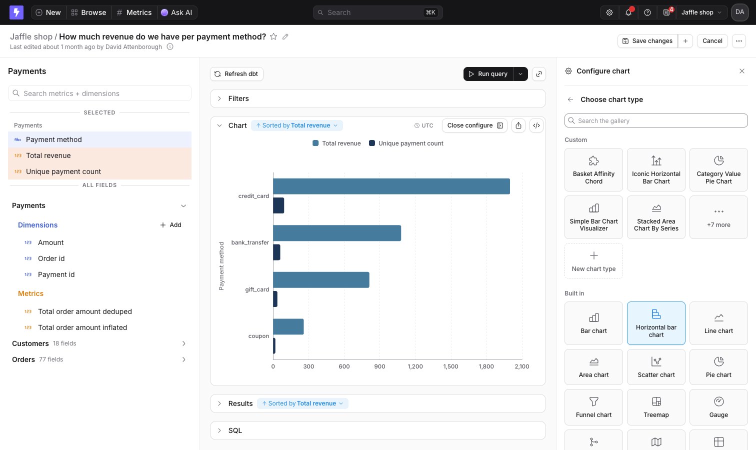
The Configure chart sidebar in the Explorer with the chart type gallery open, listing custom chart types above the built-in onesThe Configure chart sidebar in the Explorer with the chart type gallery open, listing custom chart types above the built-in ones

Install chart types from the chart library

Install ready-made Lightdash chart types for everyone in your project

Built-in charts

Bar chart

Use bar charts to compare things between different groups or track how a number changes over time

Line chart

Use line charts to show continuous changes in a number over time

Area chart

Use area charts to show how values develop over time when the total is as important as its parts

Mixed chart

Use mixed charts to combine bars, lines, and scatter charts on the same visualization

Scatter chart

Use scatter charts to look at the relationship or correlation between two variables

Pie chart

Use pie charts to visualize data that adds up to a meaningful whole

Funnel chart

Show how values fall away across the discrete stages of a process

Treemap chart

Use treemap charts to show parts of a whole using nested rectangles

Sankey chart

Visualize flows between categories, from sources through to targets

Table

Use tables for looking at tabular data or lists of things like user IDs or transactions

Big value

Use big value charts to display a single value prominently

Gauge

Highlight a single value against a qualitative range, like performance against a target

Map

Use maps to display geographic data on an interactive map

Custom charts

Custom Vega charts

One-off charts written as a Vega-Lite spec in a JSON editor, plus worked templates you can copy

Create reusable chart types with Chart Studio

Reusable chart types you build once for your project, then use like any built-in chart type